Soylent
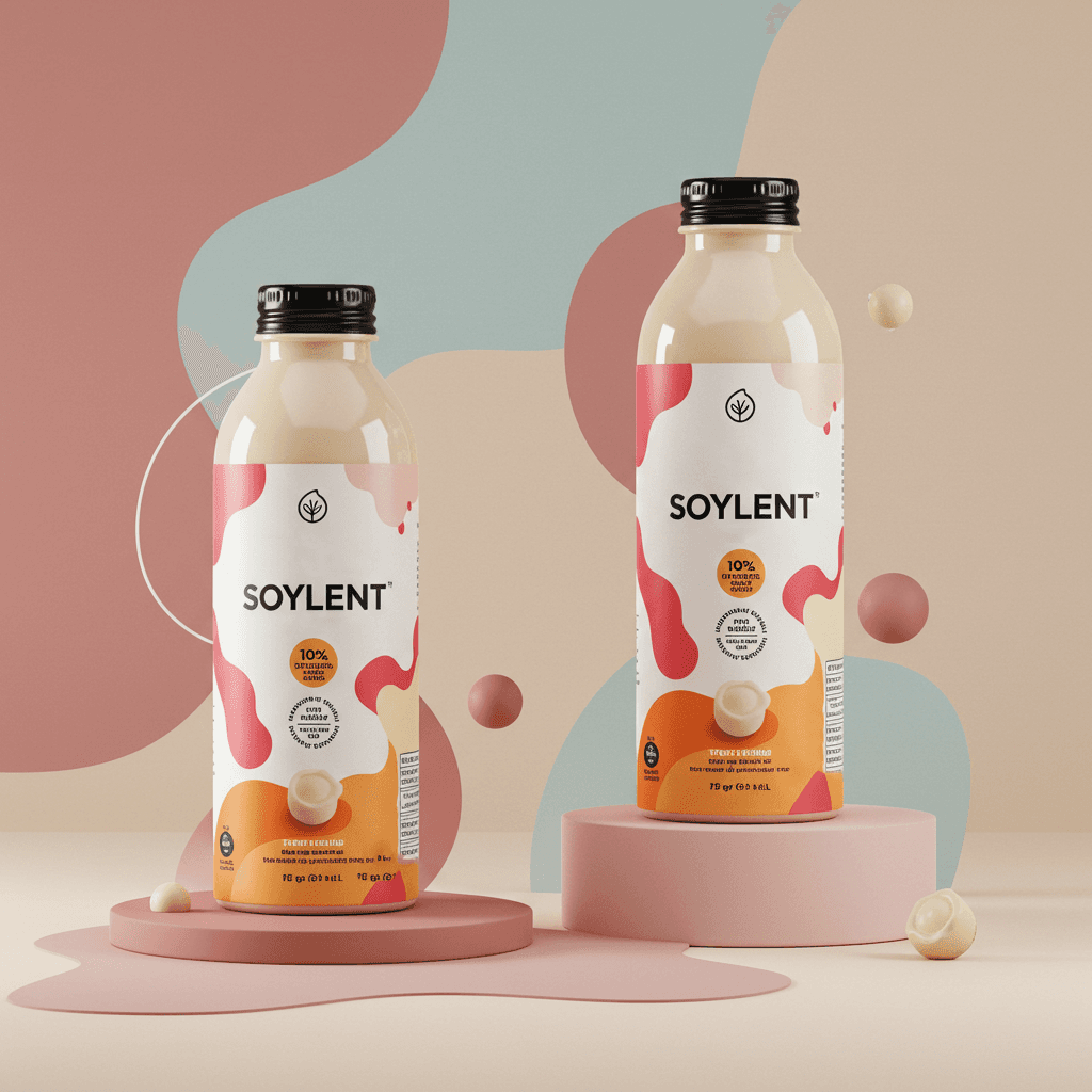
Soylent Redesign: A Vibrant Take on Minimalism


PROJECT INFO
For this project, I reimagined Soylent’s branding and product design with a fresh, modern approach. While Soylent is known for its clinical and utilitarian aesthetic, I sought to inject more visual warmth, color, and personality without compromising its minimalist ethos.
The redesign introduces a refined balance of abstract geometry, clean typography, and a richer color palette to elevate the brand’s visual presence. Through thoughtful UI enhancements and a more engaging packaging system, this concept emphasizes both functionality and beauty. The result is a design that feels both approachable and sophisticated—one that resonates with modern consumers while staying true to Soylent’s core identity.