Soylent

Soylent

Case Study:

Revitalizing Soylent's Digital and Physical Presence

PROJECT INFO

Soylent, a pioneer in meal replacement products, faced challenges with declining customer engagement and outdated packaging that no longer resonated with its target audience. The goal was to redesign both the website and packaging to better reflect Soylent's commitment to sustainability, science-backed nutrition, and modern lifestyles.​

The redesign introduces a refined balance of abstract geometry, clean typography, and a richer color palette to elevate the brand’s visual presence. Through thoughtful UI enhancements and a more engaging packaging system, this concept emphasizes both functionality and beauty. The result is a design that feels both approachable and sophisticated—one that resonates with modern consumers while staying true to Soylent’s core identity.

PROBLEM STATEMENT

Despite a strong initial following, Soylent experienced a drop in customer retention and brand perception. Feedback indicated that the packaging appeared clinical and uninviting, while the website lacked intuitive navigation and failed to communicate the brand's values effectively.​

Process

[01] User Research

Conducted surveys and interviews with existing and potential customers to gather insights on preferences and pain points.​

Analyzed website analytics to identify drop-off points and user behavior patterns.​

Reviewed customer feedback on packaging aesthetics and usability.​

[02] Insights

Users desired a more engaging and informative website experience.​

Packaging was perceived as sterile, lacking emotional connection.

There was a strong interest in the brand's sustainability efforts, which were not prominently featured.

[03] Design Solution

Redesigned the homepage to highlight Soylent's mission and sustainability initiatives.

Simplified navigation with clear categories and a user-friendly interface.

Integrated interactive elements to educate users on product benefits and ingredients.
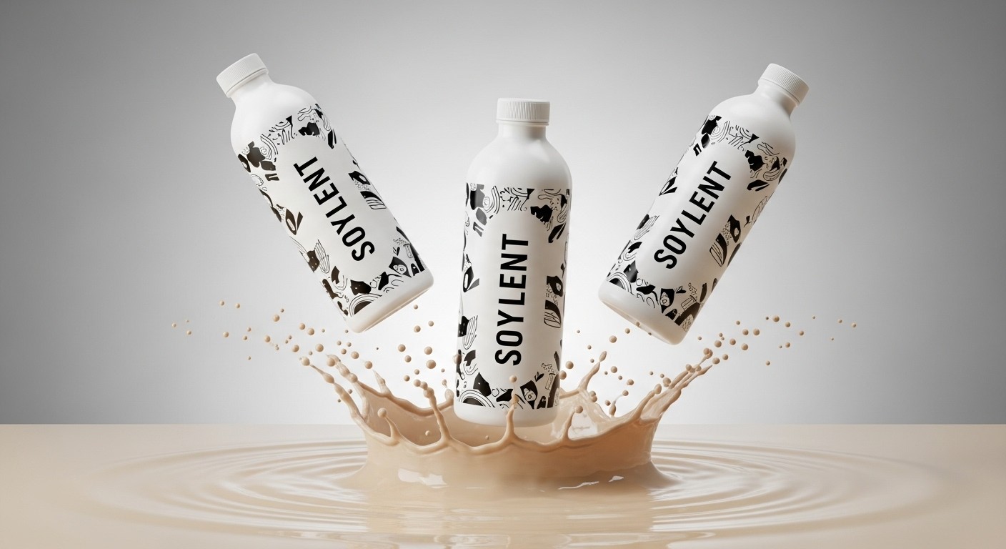
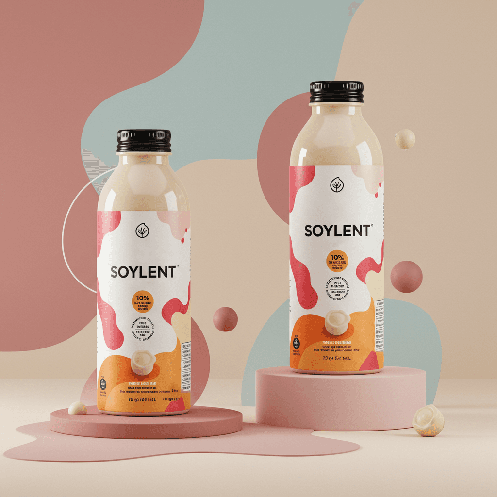
[04] Packaging

Introduced a modern, minimalist design with earthy tones to convey natural ingredients.

Utilized recyclable materials and clearly labeled sustainability information.

Enhanced readability of nutritional information and usage instructions.

Key Learnings

Simplification is key

Aligning digital and physical brand elements creates a cohesive and compelling user experience.

Simplification is key

Aligning digital and physical brand elements creates a cohesive and compelling user experience.

Simplification is key

Aligning digital and physical brand elements creates a cohesive and compelling user experience.

Iterative testing pays off

Highlighting sustainability and transparency resonates with modern consumers.

Iterative testing pays off

Highlighting sustainability and transparency resonates with modern consumers.

Iterative testing pays off

Highlighting sustainability and transparency resonates with modern consumers.

Details matter

Continuous user feedback is essential for iterative design improvements.

Details matter

Continuous user feedback is essential for iterative design improvements.

Details matter

Continuous user feedback is essential for iterative design improvements.

Smooth Scroll
This will hide itself!

Soylent

Soylent

A Vibrant Take on Minimalism

PROJECT INFO

For this project, I reimagined Soylent’s branding and product design with a fresh, modern approach. While Soylent is known for its clinical and utilitarian aesthetic, I sought to inject more visual warmth, color, and personality without compromising its minimalist ethos.

The redesign introduces a refined balance of abstract geometry, clean typography, and a richer color palette to elevate the brand’s visual presence. Through thoughtful UI enhancements and a more engaging packaging system, this concept emphasizes both functionality and beauty. The result is a design that feels both approachable and sophisticated—one that resonates with modern consumers while staying true to Soylent’s core identity.